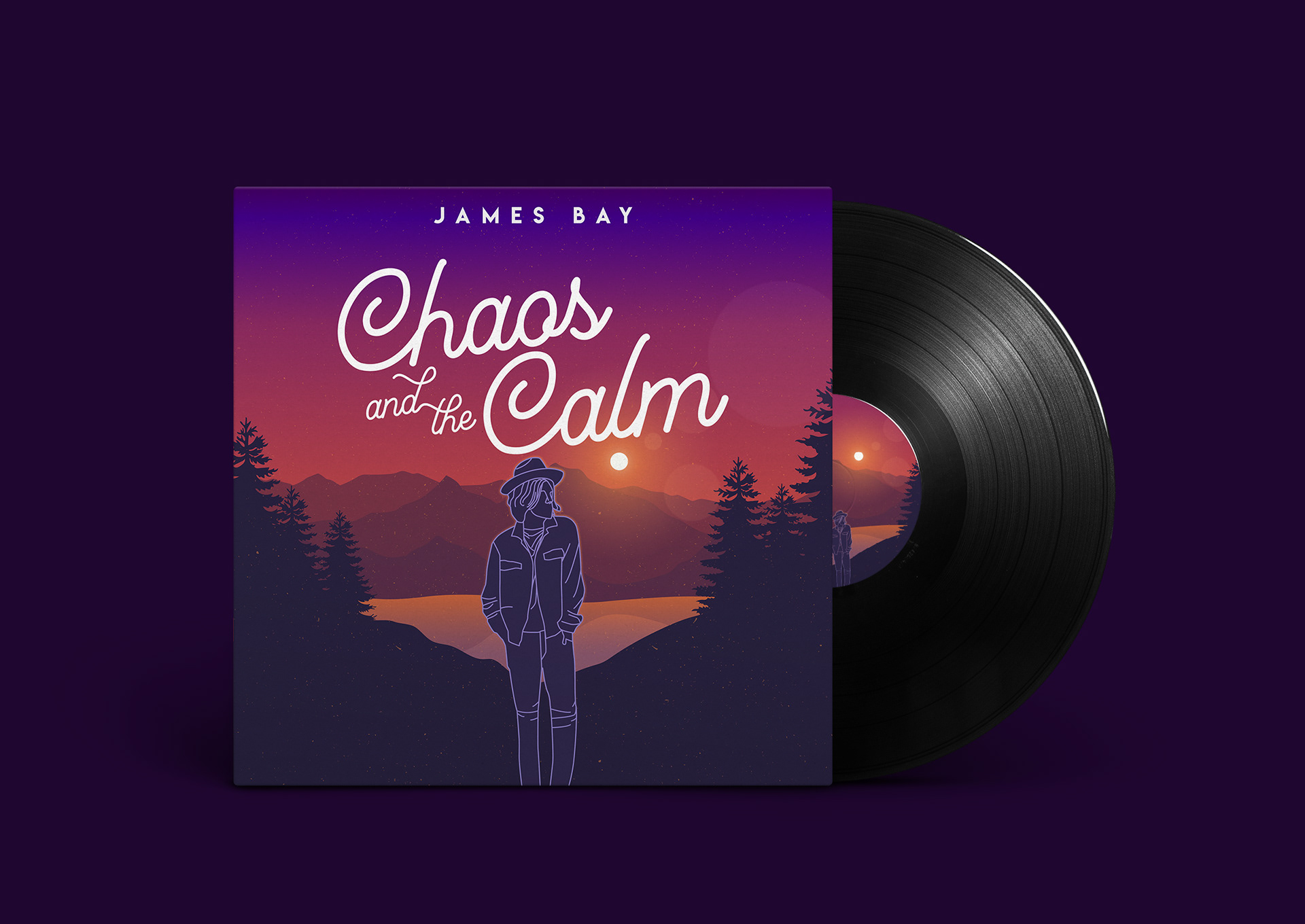
Because James Bay's music exemplified a chill vibe, I picked colors that reflect that feeling. In the middle is a line art traced of James Bay himself. This traced is based on his newest album cover's image. Many people also recognize James' music as part of the indie and chill genre. Thus, the typography I chose goes with the indie sort of vibe.

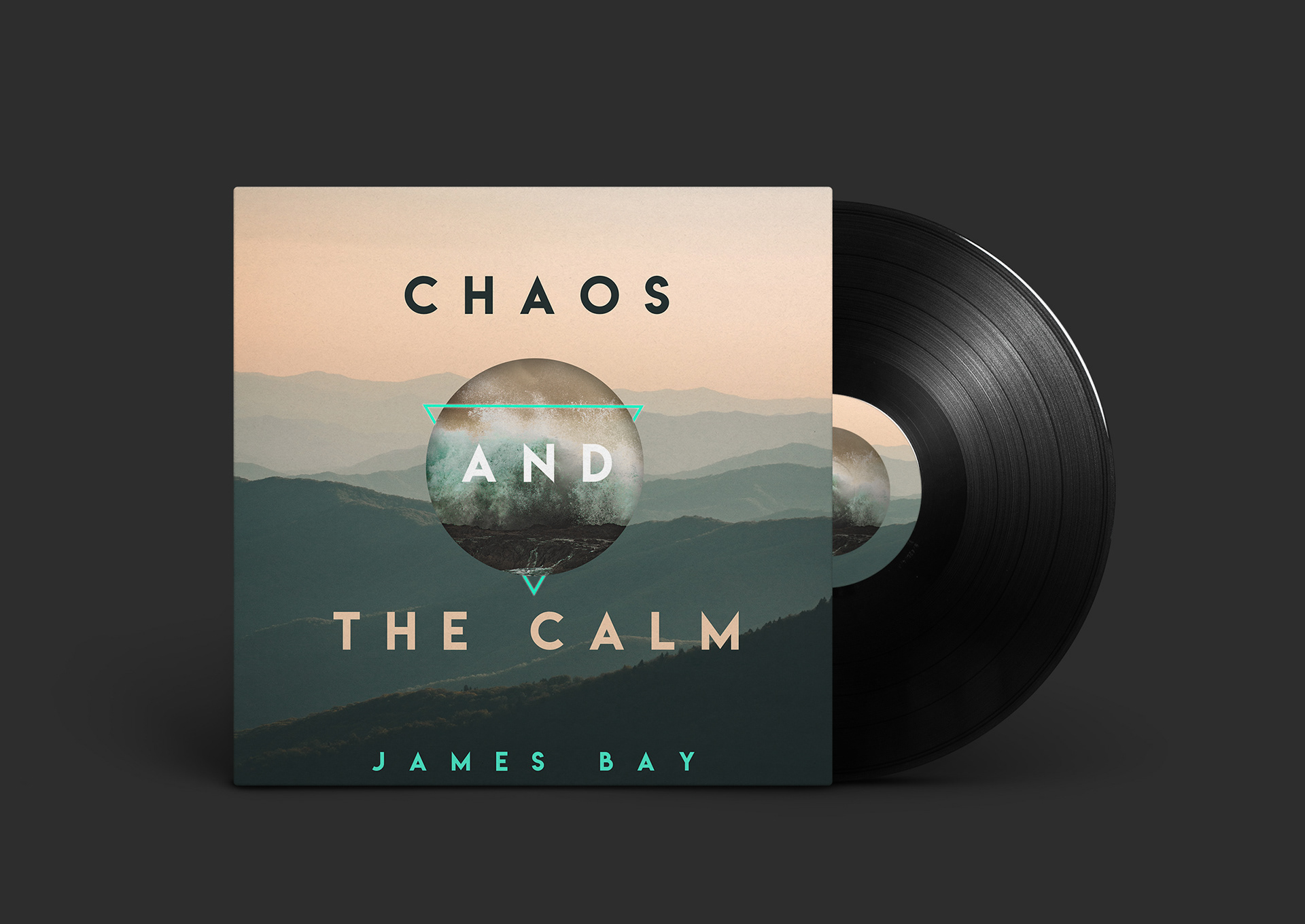

I also made another design for the same album. This time, I went with the literal imagery that the title represents. Chaos is represented in the middle with the waves crashing onto the rocks. And, the mountains in the back that occupies the majority of the space gave a very relaxing feeling to the audience. Noticed the typography is very simple to began with and the color of the title is reverse to the color that is shown in the background.